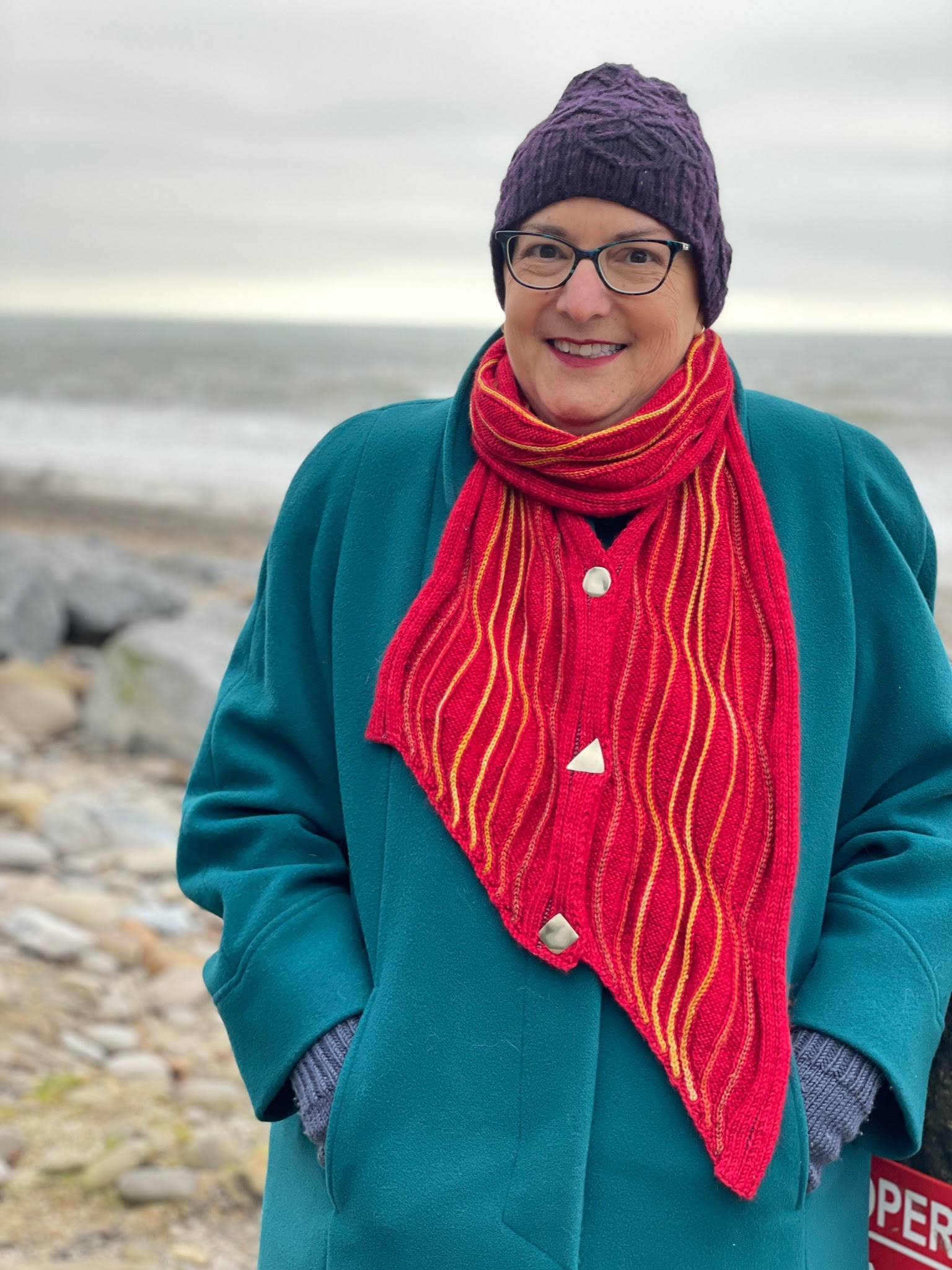
My latest pattern, Soliton Wave, was released by Anzula on Dec 1. Here's my KBFF Brenda being the perfect model!

Brenda also hosts a long running podcast, Cast On. Her latest episode, #185, "Knitting Adjacent," features an interview with me about this pattern.
There's something important about this pattern that's not evident from pictures alone... the format that I used to communicate the detailed instructions is completely new. I created it especially for this pattern, because traditional formats just didn't cut it. Below is the story of how and why I came up with the instructional format I use in the pattern. For a bite-sized pattern featuring my new format, please check out my free pattern Rosetta Stone.
Visual thinking
When it comes to knitting instructions, I have long wished for more than just basic row-by-row instructions. Sometimes there's also a grid chart, but if there are any increases or decreases, a grid chart doesn't resemble what comes off the needles.

Example of how a grid chart shows decreases... a lot of empty squares.Knitting is a three dimensional creative experience, and a grid shows only two dimensions. I often find that well-crafted photographs of a knitted item give me more useful information than any detailed instructions, because my brain perceives most knitting instructions as noise.
Soliton Wave would not exist without my two primary design building tools: Excel, and Stitch Maps. You've probably heard of Excel, but how about Stitch Maps? I got to know its creator, JC Briar, after she had finished the underlying science but before she had launched it. It is an incredible visualization tool, and a perfect complement to my strange brain.
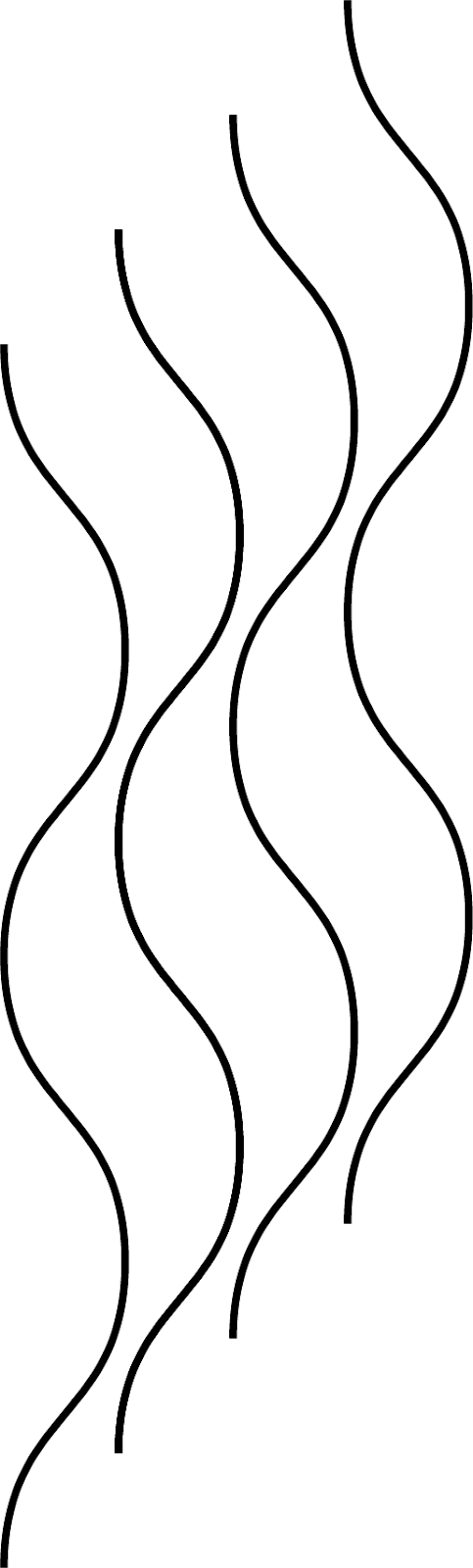
The basic structural building blocks of Soliton Wave are increases and decreases, used as surface decoration, to create curving channels of purl stitches. My first design that featured this effect was Tachyon, a clocks sock worked from the toe up. In Tachyon, the curves are parallel, so the rhythm of working knits, purls, increases and decreases across any given row is relatively straightforward.
Soliton Wave, however, takes those waves and staggers them longitudinally.
When the waves are staggered like this, the rhythm of movements across any individual row is harder to follow. Unfortunately, standard knitting instructional formats don't provide the visualization power that a pattern like this needs.
So, I came up with my own format.
Shred the Envelope
In essence, my new format is an annotated Stitch Map. It is an outgrowth of how I design my patterns (build in Excel, render in Stitch Maps; then iterate, rinse and repeat.) I'll walk you through how I design, and how that led me to create the format for Soliton Wave.
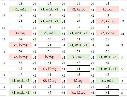
Starting out in Excel, here is a sample single column that expands and contracts in size, based on placement of increases and decreases over a series of rounds. (This shows the RS view.) I've added some green and red shading to help show where the curve expands and contracts. Think of this as a building block of a larger design.
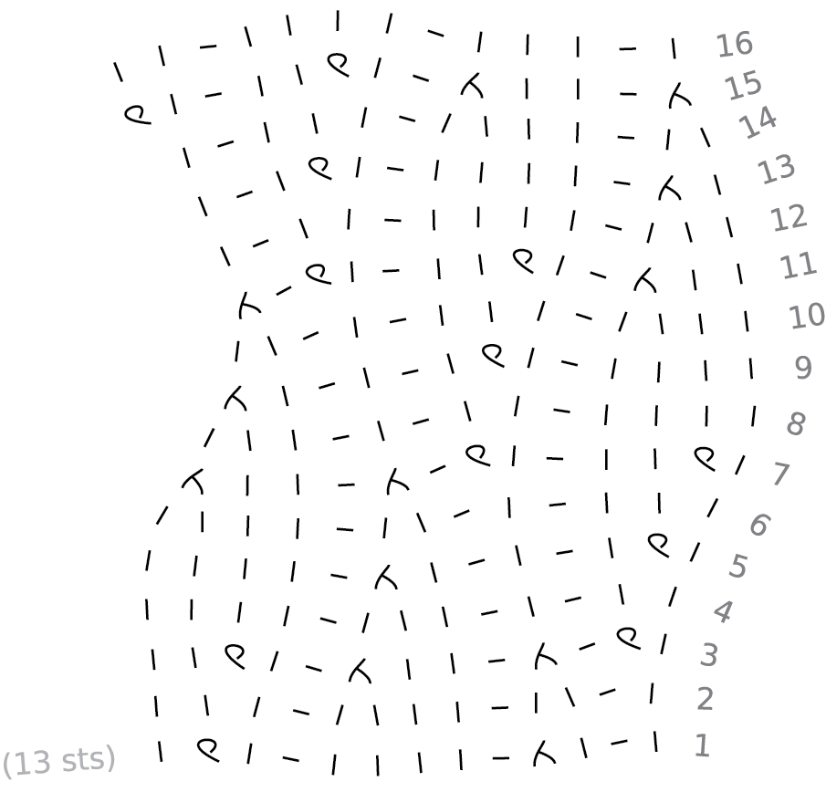
If I plug this into Stitch Maps, this is what I get.
Now I can add more columns in Excel, separated by purl channels, and stagger the vertical position of these columns. The cell with the border around it in each column is the base of each curve. Can you see the pattern? Each column is offset from its neighbor by 4 rounds.
Plugging that into Stitch Maps, you get this:
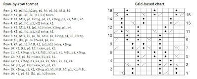
If I were limited to using traditional formats for writing up this design, I would have to transform my excel table and stitch map into this:
I don't know about you, but when I look at these traditional instructions I have a difficult time seeing any visual relationships, whereas they are so clear to me in Excel and Stitch Maps. And this is just a swatch; when scaled up to a full size scarf or wrap, it becomes very difficult to navigate instructions in either of these formats.
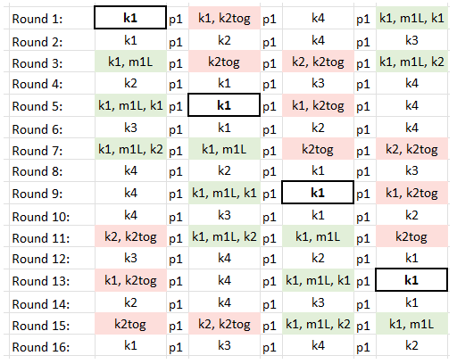
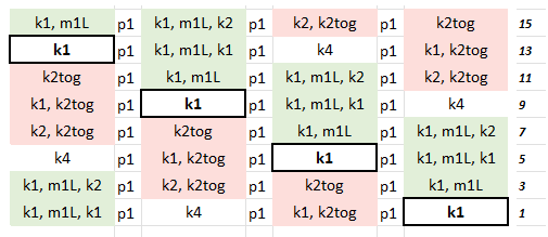
So, let's take my little Excel table and re-sort the columns and rows to line up with the stitch map. Like any chart, it starts at the bottom right corner. Columns are laid out from right to left, the direction in which we knit; instructions inside each cell read from left to right, the direction in which we read.
Can I just take a moment here to kvetch about how terribly inconvenient it is for me as a knit designer, that we read in the opposite direction than we knit!
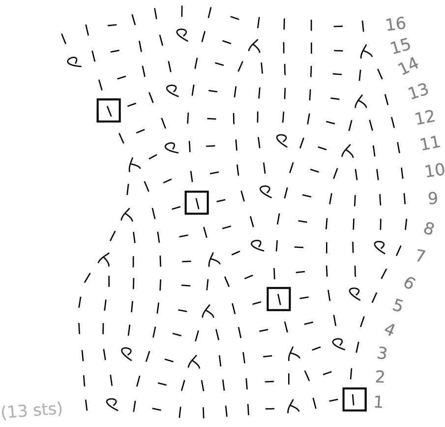
Just to make it a little easier to visualize the relationship between Excel and Stitch Maps, here's that stitch map again, this time indicating the same stitch that is boxed in the Excel chart.
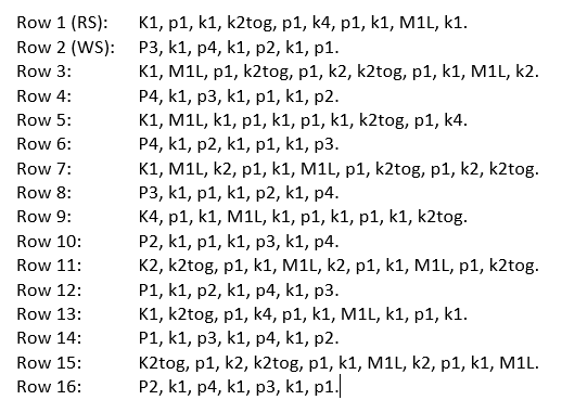
The problem I faced now was how to express the WS rows. When I'm building a design I always write it from the RS of the fabric. But if the fabric is worked back and forth, the instructions need to change the direction of the WS rows, and swap knits for purls. This is a pain to do, and it completely wrecks the visualization of the curves traveling longitudinally along the fabric. What a mess!
But there's a simple solution here. Since all the shaping happens on RS rows, I dropped all WS rows from my little chart, and added general instructions to work every WS row in pattern (knit the knits, purl the purls).
And now we have this.
Which is, I think, so much better than this:
If you build it, they will come.
I know it's madness for me to come up with a completely new format. Knitters are accustomed and attached to the formats that they use, and my new format is completely unlike anything else out there. I have no idea how this will land. But I needed to do this. I'm sure I'm not the only knitter out there who struggles to visualize the end result from existing traditional formats. I needed to break out of that box and trust myself. I did this for me, but I hope it will help others.
💜


.png)